Friday, March 26, 2010

Logo Updates!

Oo La Lovely's logo is FINISHED! It was a fun process, and I hope my client (aka my sister-in law), is happy with the results! I think it turned out looking vintage and sophisticated. Here are some options I designed and the final result.


Monday, March 1, 2010

oo la lovely logo

I still have quite a bit of work to do on this! But the color palette is done, as well as the font choice! Here is a few me and my client (sister-in law, Lyndsi) liked. She ended up choosing the first one on top (#1). I'll make sure to show the finished logo soon :)

Monday, February 22, 2010

New Logo and Mask Catalog article layout

If you haven't noticed, I've created a new personal logo, as an assignment for my portfolio class. My teacher and other students liked the contrast between the two letters (a really bold, blocky D with a dainty-looking lowercase f), and I like the background a lot too. The background is actually my own work from my Drawing II class I took at Snow. To achieve the watercolor look, we painted layers and layers of watered down acrylic paint on paper and used blow dryers, paper towels, sponges, and once it dried, sand paper to reveal hidden layers and create interesting textures and patterns! It was a really enjoyable process and I'm glad I can use it in a graphic design project. I have tweaked the color in photoshop to make it a bold, bright turquoise blue. What do you think?

Also, here is my mask catalog feature article layout design. This turned out pretty well too, I think, after a lot of tweaking and me getting over my fear of white space- just kidding :) I usually have a hard time making lots of white space though; I tend to want to fill the whole page, which leads to boring design. Enjoy!


Sunday, January 31, 2010

Product Design: Alter Ego Mask

For my layout design class, we were asked to design and create a mask that represents our alter ego. Once our masks are finished and professionally photographed, we get to design a catalog for them! It should be pretty fun! Anyways, my alter ego was to be more bold (fearless, spontaneous, speak out more), etc. Everyone who knows me knows I have been known as being "too nice", so I figured "bold" could be a good description!

Here are some pictures of the mask as a work in progress:


I decided to use paper mache. I did like 5 or 6 layers of it, using water and flour to make the paste, and used a half of a milk jug for the form!

Here's the final layer of paper mache. It's just white computer paper.


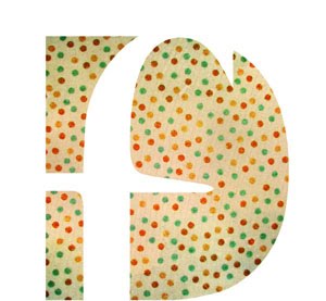
Here's the mask after applying lots of yellowish-orange paint and gluing on string to make the design on the outside. Yellow is a BOLD color right?

We had a few days after our critique to make some minor changes/upgrades. I added some more color to mine to make it seem ever more BOLD. The blue eyes alone made it look kind of sad!

My finished product!

Hanging on the wall...


That's it! Overall, it was a fun project and I learned how to better my paper mache skills, painting skills, etc. :)