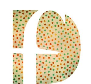
If you haven't noticed, I've created a new personal logo, as an assignment for my portfolio class. My teacher and other students liked the contrast between the two letters (a really bold, blocky D with a dainty-looking lowercase f), and I like the background a lot too. The background is actually my own work from my Drawing II class I took at Snow. To achieve the watercolor look, we painted layers and layers of watered down acrylic paint on paper and used blow dryers, paper towels, sponges, and once it dried, sand paper to reveal hidden layers and create interesting textures and patterns! It was a really enjoyable process and I'm glad I can use it in a graphic design project. I have tweaked the color in photoshop to make it a bold, bright turquoise blue. What do you think?
Also, here is my mask catalog feature article layout design. This turned out pretty well too, I think, after a lot of tweaking and me getting over my fear of white space- just kidding :) I usually have a hard time making lots of white space though; I tend to want to fill the whole page, which leads to boring design. Enjoy!


Wow!your logo is very unique,try to pursue the career of catalog layout artist,I think you have an potential.
ReplyDelete